Created with sketch and Figma
UX CASE STUDY: Designing a Food order Customization app for a cafe
Urban Panini Cafe bases its concept on popular U.S. nationwide quick service restaurants. It caters to families, local businesses, and commuters by offering a range of healthy options. The cafe emphasizes ingredient transparency and provides a personalized dining experience for its customers.
I developed a food customization app for Urban Panini Cafe. As the restaurant market is highly competitive and customers are increasingly conscious of their dietary requirements, it becomes essential to be inclusive and design with their needs in mind.
THE CHALLENGE:
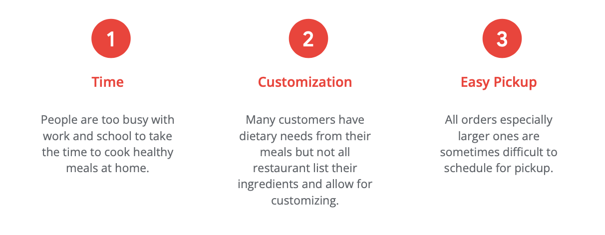
Customers often need to know their meal's ingredients for dietary reasons or personal preferences. However, restaurants do not always offer ingredient transparency or customization on their ordering platforms.
THE AUDIENCE:
The main demographic, ranging from professionals to retirees, consists of individuals between ages 18-65 years old. These targeted users order out at least once a week.
The GOAl:
Design an app for Urban Panini Cafe that enables all users to easily customize their orders and view ingredients for a personalized experience.
SCOPE OF WORk
UX Research Process
Product Research
Accessibility research
Personas
User Stories
User Journey Maps
Competitive Audit
Site Map
Task Flow
Ideation
Design exercises,“How might we” and Crazy 8’s
Paper Wireframes
Digital Wireframes
Low-fidelity prototype
Usability Study
Create study plan
Conduct Unmoderated Studies
Affinity Map
Design
UI Design
Style Guide
Mockups
Design Iterations
High-fidelity Prototype
UX Research Process
I conducted interviews with individuals aged 18-65 who regularly order food delivery and generated personas based on these interviews. To gain deeper insights into potential customers and their requirements, I developed empathy maps. The predominant shared characteristic among the users is their busy schedules and a strong demand for quick and healthy meal options. However, dining out has become more complex for modern individuals due to increased awareness of food allergies and dietary restrictions.
Initially, I prioritized meal customization primarily for addressing dietary needs like allergies. However, it became evident that this customization was equally important for other groups, such as parents. In many cases, parents found it crucial to customize meals according to their children's food preferences.
Before proceeding with the research process, I outlined the app's targeted pain points. Additionally, I worked on developing the necessary accessibility practices.
Accessibility cHECKLIST:
Considered and researched screen reader abilities (i.e. no text in field boxes).
Followed WCAG guidelines for color contrast accessibility.
Implemented images for further product information.
Pain Points:
Personas:
Ensuring widespread usability, I created two diverse personas. Each persona represents the common thread and needs of the target audience. These personas and their scenarios played a crucial role in informing the rest of the design process.
User Stories:
User stories articulate the motivations and needs of the persona. Understanding a persona's motivations, such as valuing family time, during the ideation phase contributes to the success of the product.
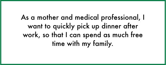

User Journey Map:
I created a user journey map to visually outline the customer's interaction with the Urban Panini app. This approach offers a comprehensive outlook on the customer experience and exposes pain points. By mapping Darleen’s user journey, we discovered the significance of images in the ordering process and the essential need for various options to customize orders.
Competitive Audit:
I performed a competitive audit to learn more about the direct and indirect competitors in the food customization app space.
Our key competitors are Panera Bread and Corner Bakery, fresh ingredient chain cafes. Both restaurants are nationwide, offering ingredient breakdown and customization on their apps.
The indirect competitors are Porto’s Cafe, a family owned business with locations in the Los Angeles area. Starbucks is an indirect competitor. Though they are a worldwide chain cafe, they are less of a competitor for food and customizing healthy ingredients. Their food is pre-made and warmed at the cafes.
Here are the strengths and weaknesses I identified through my use of the four apps.
Panera Bread Weaknesses:
Only available in English
No audio assistance
Have to login for checkout
Panera Bread Strengths:
Visually appealing
Allows to custom every item on the menu using checkboxes
Includes the ingredients of every product
Free reward membership
Corner Bakery Weaknesses:
Navigation is confusing especially with subcategories
Lacks a strong brand identity
No accessibility button
Corner Bakery Strengths:
Images for every item on the menu
Face recognition for login
Free reward membership
Porto's Bakery Weaknesses:
Have to login for checkout
Limited ingredient information
Only available in English
Porto's Bakery Strengths:
Easy to navigate
Lots of images and details
Allows for advance ordering
Starbucks Weaknesses:
Have to login for checkout
Limited amount of accessibility features
Starbucks Strengths:
Visually appealing
Easy to navigate
Easy to Customize
Upon completing the competitive audit, I took a close look at areas the app can fill in the gaps. One area is creating a guest customer option for people who prefer a fast checkout without the need for account registration. I'm actively looking into adding more features that would make it user-friendly for everyone. Also, focusing on providing more details about the ingredients on the menu items. Lastly, developing a user flow that is simple to follow, providing helpful guidance and an enjoyable experience for use
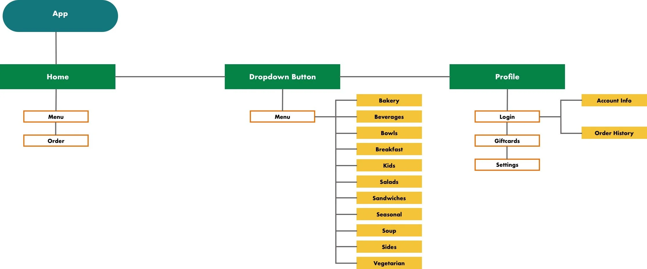
Site Map:
I created a sitemap from start to finish, focusing on intuitive and logical navigation. The target audience is familiar with ordering food on apps. It’s important to design the navigation in a way that is familiar to users. Considering user’s needs and expectations will create a successful product. Once I laid out the sitemap, it helped identify gaps in the functionality. At first glance, starting from scratch to design the sitemap might seem to impose fewer restrictions. However, it's imperative to plan for scalability to accommodate future growth. Thinking about how designers can plan and iterate on the layout as the application matures. This reduces the chances of making significant changes at later stages, saving time and money.
Task FLOW:
Applying Darleen's personas, I created a task flow reflecting a potential scenario.
Darleen is leaving work at the hospital and needs to pick up dinner for her family of 4. She is picking up dinner from the restaurant location 10 mins away from her house. Darleen has a 40-minute commute, she needs to place an advance order and specify a pickup time to ensure the food warm upon her arrival. Here is the task flow for Darleen's order.
IDEATION
Paper WIREFRAMES:
Taking the app goals into account, I designed the paper wireframes to include a user flow starting at the homepage and ending at the confirmation page. Along the way customers set the pickup time and customize ingredients.
Digital WireframeS and low-fidelity prototype:
Early designs focus on fundamental user needs like creating the start of the user flow, as shown. This wireframe features the order button. One of the goals based on user research is customization. This wireframe is an early design for ingredient customization.
After designing the wireframes, I built the low-fidelity prototype for user studies. The low-fidelity prototype guides the user from the homepage to the ordering process to the final confirmation page.
Usability study
Study Plan:
We’re designing a responsive cooking tutorial website for desktop and mobile. The site helps cooks find their desired recipes based on their needs. We need to find out if users can easily switch between desktop and mobile? Do they understand how to complete their goals on both platforms without having to relearn the site’s layout? It’s important the videos are accessible for those with disabilities.
Throughout the study, participants were tasked with customizing and placing orders using a low-fidelity prototype. Below, you'll find the study plan and the outlined study requirements.
Methodology
20-30 mins
United States, remote
Unmoderated usability study
Participants
5 participants
Ages between 10-55
Participants are home cooks with no formal training in culinary who cook at least once a week.
Three females and two males between ages 10-55. One participant has a son with a visual impairment.
The study is accessible for use with screen reader and a switch device
Key Performance Indicators
Use of navigation vs. search
Drop-off rates
Conversion rates
System Usability Scale
For the unmoderated usability study, I wrote a script for the participants to follow. Writing a script helps to keep every user experience uniform. Ensuring the user feedback is a result of the the exact same experience. Throughout the study, each participant follows the designated prompt. Below is an example of a prompt a participant received in the unmoderated usability study.
Prompt 1: Starting on the homepage, find a recipe category using the navigation bar.
Follow up : How easy or difficult was this task to complete? Did the navigation headers make sense?
Upon concluding the study, each participant engaged in a survey. The questions rated on a scale ranging from “strongly disagree” to “strongly agree”. Sample questions included "I would use this site again." and "The recipe is easy to follow”.
Affinity Map:
After collecting detailed notes from the user studies, I created an affinity diagram. Putting together the diagram involves reflecting on the user's insights and grouping together similar information. This grouping helps to identify patterns, common themes, and underlying user issues.
Usability Study Results:
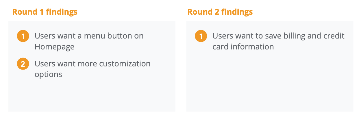
After organizing the data from the affinity map, I outlined the key findings from the initial usability study.
People want a menu button on homepage
3 out of 5 total participants questioned where the menu was on the homepage
Not all participants understood they could view menu from the order button on the homepage
People want more customization options
4 out of 5 total participants had additional customization requests
2 participants would like the ability to adjust the quantity of the same item.
1 participants requested how to adjust the amount of a certain ingredient i.e. light cheese.
Design
UI Design:
Designing an accessible user interface (UI) right from the start is a valuable investment. For both UX and UI, thinking about accessibility from the beginning is not only good for the users, but for the company. The more reach the product has the more return a business will see on the product investment.
When we focus on accessibility, it means that everyone, no matter what their abilities or disabilities are, can use and interact with the app. A major principle of designing accessible UI is about making content easy to read / listen to and interact with. For example, following the WCAG guidelines for color contrast is important. It's especially important for users who might have partial vision which represents most vision disabilities.
Mockups and Prototypes:
Having implemented the UI designs, my next step was to bring the concept to life by creating the mockups. These mockups are high-fidelity designs and bridging the gap between UX and UI. Showcasing the layout, color scheme, typography and visual hierarchy, the mockups serve as a simulation of the complete product experience.
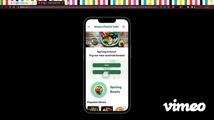
After reflecting on the 1st usability study findings, I revised the homepage to include a separate menu button for the customers to browse before placing an order. The homepage also now features a popular item carousel for customers.
The usability study revealed customers wanted more customization options. The revised design includes ingredient quantity customization (i.e. easy, regular, extra)
The final high-fidelity prototype executed the findings from both usability studies. The prototype follows the user’s experience from the order button to the order confirmation.
Click for Mobile Prototype
Takeaways
What I learned:
While working on the Urban Panini Cafe app, I learned the importance of observing my own bias and how usability studies reveal the actual user's needs. I gained insights into unmoderated studies and the importance of crafting user scripts, along with the skill of reviewing their feedback and prioritizing based on common insights.
I realized the importance of taking the time to design for an inclusive user experience from the beginning. I learned more about screen readers, their functionality, and the best ways to design for them. For instance, I discovered that screen readers can properly instruct users when field forms are kept empty and instructions are placed outside of the field. Overall, focusing on accessibility led me to learn and implement designs that I wasn't familiar with.
Next Steps:
Conduct another round of usability studies emphasizing in accessibility for any areas of improvement.
Make any necessary alterations to the designs based on newly conducted studies.