Created with sketch, Illustrator, and invision
UX CASE STUDY: Designing Information Architecture and UI for Software Developer Blog
Kevin London is a blogger and Software Engineer for Amazon. He's looking to connect with other people in his industry through his articles. Share his expertise and provide technical information for new and established developers. Though he's found success sharing articles on websites like Hacker News. Refocusing on the UX and UI experience may increase user engagement and create more returning readers.
The Challenge:
Designing Information Architecture for the blog is a main pain point. Currently all the articles appear based on publication date. Thus, making it difficult for readers to search for specific topics. Designing information architecture that allows readers to find specific content is key. Another goal is to provide a way to view the most popular articles as well as related articles.
The secondary pain point is designing a cohesive UI for the website and creating a style guide. A goal for the UI is to provide a way for readers to know more about an article before clicking on it such as "Read More" links. "Read more” links allow website administrators to track the most popular content.
The audience:
The Primary audience is other developers in the community. Developers looking to learn more about the industry or specific technology. A smaller demographic are managers and QA who are less technical but still interested in technology. The third demographic are friends and coworkers personally linked to articles. They are looking to raise their technical literacy. The principal goal is to educate rather than entertain.
Goal Outline:
Create Information Architecture for the website
Design the UI by building a color palette, typography, icons and other UI Elements
Create a style guide
Scope of Work
User Research
Client Research
Desktop and Mobile Research
Competitor Research
Research Analysis
Affinity Mapping
Card Sorting
Personas
Site Map
User Flow
Design Ideation
Idea Sketches
Wireframes
Prototypes
User Testing
Design Iterations
UI Design
Icon Design
Branding and Style Guide
Layout and Responsiveness
UI Prototypes
Execution
Client Communication
Hand off to Developer
Research Process
Client and Competitor research:
I started off by talking to the client to get a full understanding of what he wants from the blog. Before the user research begins, it’s important to me to understand his expectations and needs for the project. Since, he is also the audience of other tech blogs. I wanted to know more about the resources he uses and why he enjoys the user experience. He directed me to a few websites.
Taking his leads, I researched how other bloggers and tech sites provided information to their audience. Some of my observations of successful user experiences focused on readability. The sites weren’t too busy with visuals or dense with information. There was a clear information hierarchy. I could search for articles with either a pull down menu or search bar. Less successful user experiences felt overwhelming with lists of articles with little description.
Affinity Map:
I organized my data into similar groups, based on how a user might navigate the site.
Learning More
Navigating the Front Page
Searching for specific topics
By organizing data into smaller groups, I analyzed the connections and found patterns. Determining what experiences are a priority moving forward.
Card Sorting:
The card sorting sessions educated me about the user’s needs and their expectations. I conducted several rounds which led to the information architecture blueprint. Users participated in both open and closed card sorting sessions.
Open Card Sorting: I asked participants to organize 20 article titles into categories. Once cards were in groups, I asked to label each of those categories. Giving participants freedom to label, helped me understand the user's expectations. Observing user's logic when categorizing helped me understand what was important moving forward.
Closed Card Sorting: Based on the results of the open card sorting, I narrowed down the categories to the four most common labels. Based on what they felt was appropriate, the participants categorized the 20 cards into the new four categories. Observing sessions helped clarify whether those labels were appropriate to the majority of users.


Personas:
Who is the audience? After briefing the client, I collected 3 defined user personas. Each persona has specific goals and pain points navigating the site.
Why create personas? Personas give a face and personality to the potential users. Creating them helped me to empathize with each unique experience as user’s needs vary from each other.
Here are three main demographics:
Developers looking for industry information and picking up tips.
Professionals outside of developers. Readers interested in furthering their knowledge in technology and interested in development tips.
Non-technical readers looking for relevant advice or looking to raise their technical literacy.
Site Map:
Using the results of the card sorting sessions and competitor research, I designed a site map laying out the website’s hierarchy. In pursuit of creating an intuitive website navigation, the map represents where users can expect to find resources. As a designer, the site map is also a visual aid for future designs including the information architecture and wireframes in the ideation process.

user Flow:
After defining the personas, I created a user flow for the most common user experience and goal.
Looking for specific topics.
Creating a user flow helps me define the steps a user will do to accomplish their goal. In this user flow, the reader is using the drop-down menu to navigate article categories.

DESIGN IDEATION
Storyboard:
I utilized the user flow as a jumping point for the storyboard. Creating the storyboard helped me further empathize with the user by visualizing every thought and decision. Storyboarding takes user flows and bakes emotion into the user's experience, much like personas. In this storyboard, I am following the thoughts and actions of a reader going from casual reader to bookmarking for future readings. A success story of a returning reader.
Sketching:
Using the site map and user flow as a guide, I sketched the site's main screens. Sketching is a low-fi and quick way of exploring the information architecture. A lot of the design is implemented in the finally product. Because sketching is low stakes, I could play with ideas that don't always work out. For example in this sketch, I featured a "search" bar which was later removed.
Wireframe:
Wireframes are a skeletal framework for the site. Creating Medium fidelity wireframes gave me the opportunity to design without getting distracted by appearance (i.e. color palette). Instead, I focused on functionality by laying out page elements.
UI Design
After working on the wireframes, I focused on the visual design for the project. During the early research process, I created an inspiration board. I gathered images from other tech blogs and suggested sites from the client.
During the research process, I communicated with the client on his visual preferences, such as color. It's important that I understand a client's taste so I create a UI that they will live with them long term. So I provided three options for primary and secondary colors along with a few icon choices. After reviewing the choices with the client, we landed on the final style guide shown below. The style guide is a blue print for development and can be updated as the site continues to evolve.
Prototypes:
Bringing together the UI decisions with the wireframes, I designed both the desktop and mobile prototypes. Below is the front page along with the UX of navigating for articles. My goal is for the experience to feel intuitive and familiar to what a user might experience at other blogs. In regards to the mobile design, it compliments the desktop experience. The experience is similar but adjusted for the smaller screen. I don't want to ask a user to relearn a site when they are on either platforms.

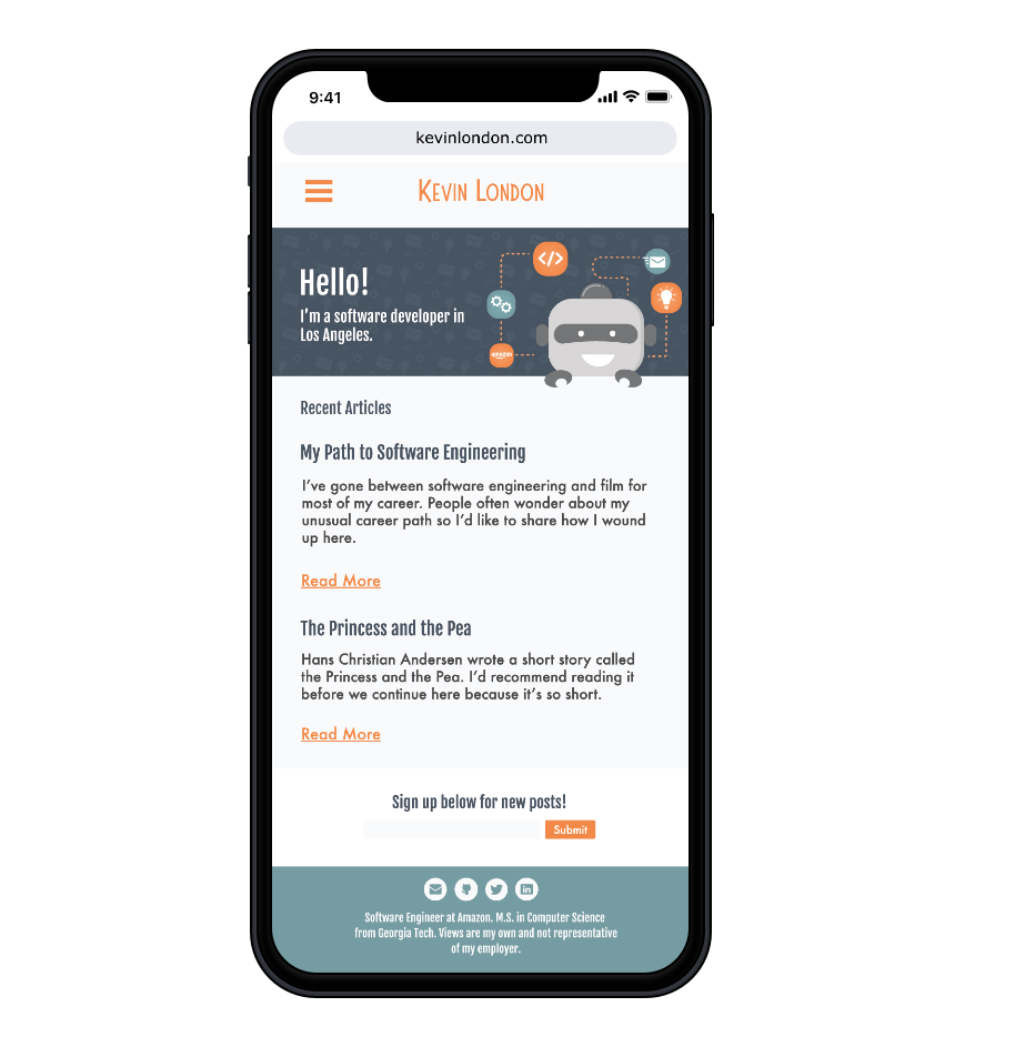
Click for Mobile UX
Reflection
Designing the blog was rewarding and kept me challenged to learn and grow.
Through this project, I realized the importance of interviewing and testing throughout each stage of the project. User feedback kept the project on track for its true purpose, well designed user experience. As a designer, it can get distracting to design for yourself but user testing kept me user focused.
Similarly to user testing, early research is invaluable. Time is spent upfront, but ultimately saves a lot time by creating an early blue print.
Creating a website for both mobile and desktop held me responsible to make sure experience between platforms were an easy transition. Designing the UI from the bottom up was an enjoyable, but tricky task. I always want to make sure the client feels their taste and voice is present. I want to elevate a client's aesthetic and not just design for myself. I'm pleased with the end result as it reflects the client and his audience.